Monday, February 6, 2017

For my design evaluation I have decided to use movie posters. Movies are a very big passion of mine and I believe a good or bad poster can make or break the way I look at the movie and gauge my interest.


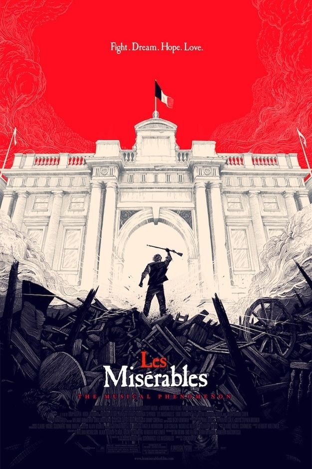
The Les Mis movie poster (Good design):

  • One Gestalt principle this poster demonstrates is the law of Pragnanz. At first glance your brain tells you it is a french flag, but is you look closer you see a more complex picture.  
  • Color for this poster has a huge effect on the way you see the poster, as the colors on the poster represent the colors on the french flag. 
  • This poster uses another good design principle in the way the lines in the barricade draw your eyes and brings your attention to the french flag atop the white building.
  • This poster shows harmony in how all the different design elements come together to create a well balanced picture and relates to the movies plot. 

Baby genius poster (Bad design)
  • This poster has some really bad design qualities; One of the first things I see in bad design is the lack of empty space, making this poster cluttered and hard to look at.
  • There is too much happening in this poster (The church in the background, the man, the weird symbols up top, etc.) this to me makes it hard to navigate and get the plot of the movie across.
  • It is hard to get the information due to the many lines in this picture going in so many directions. For example the lights bring your attention to the babies, but the baby in the ball immediately takes your attention away from the information.


Wednesday, January 25, 2017


The Gestalt principles apply to this photograph in many ways. Take the principle of figure to ground for example; the contrast between the road line (foreground) and the sky (Background) demonstrates the difference  between negative and positive space. The photograph also shows amazing contrast between color with the road as dark and sky as light, but are harmonized by the snow on the road to blend them and exhibits but another Gestalt principle; the law of closure.

Wednesday, January 18, 2017

I love the way an artist can bring so much life to a canvas. In this specific piece of art the artist uses different design aspects that appeals to me. One aspect the artist uses is the different hues and intensity of the color, and they way they use the harshness and softness of the color to bring this raven to life. Another way the artist uses the color is the change from an acrylic harder texture to a softer watercolor texture to bring the negative and positive space together. Another design aspect the artist uses is their way of not using harsh lines and giving the panting a softer feel.